- Future of Behavioral Health
- Bunch Health Website
- Strong as Granite Ads
- Enfield Report
- Nexus-9 Network
- MedForums Social Media
- BrightLux Packaging
- CareerWise Colorado Branding
- Time to Wake
- Tatsu Izakaya Menu
- NCIA Advertising
- VitalGrace Packaging
- AWN Covers
- Jackson Pollock Website
- Renewable Energy Posters
- AIGA RMCAD
- Global Warming Infographic
- Cost of Water Ad
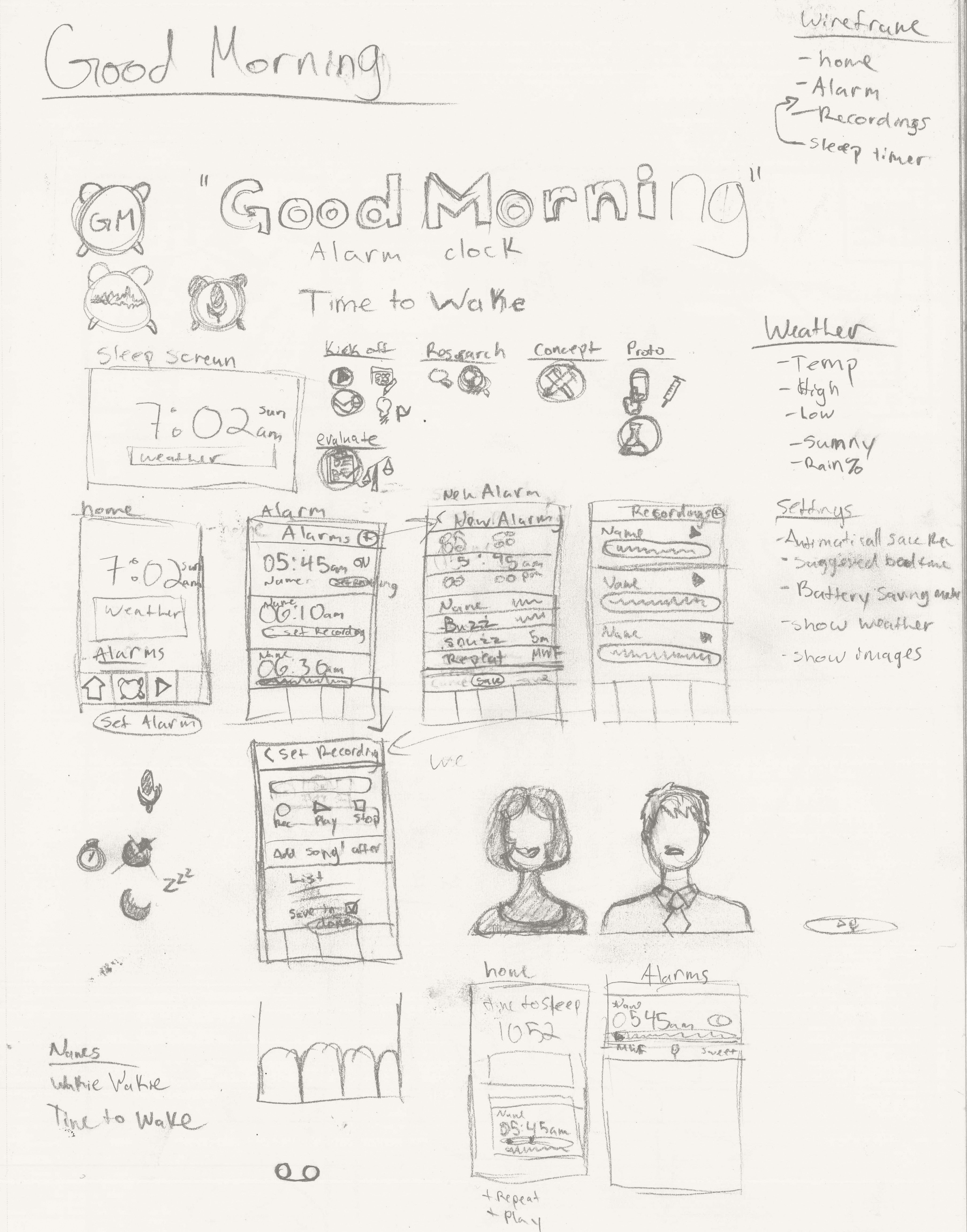
STORY BOARDS
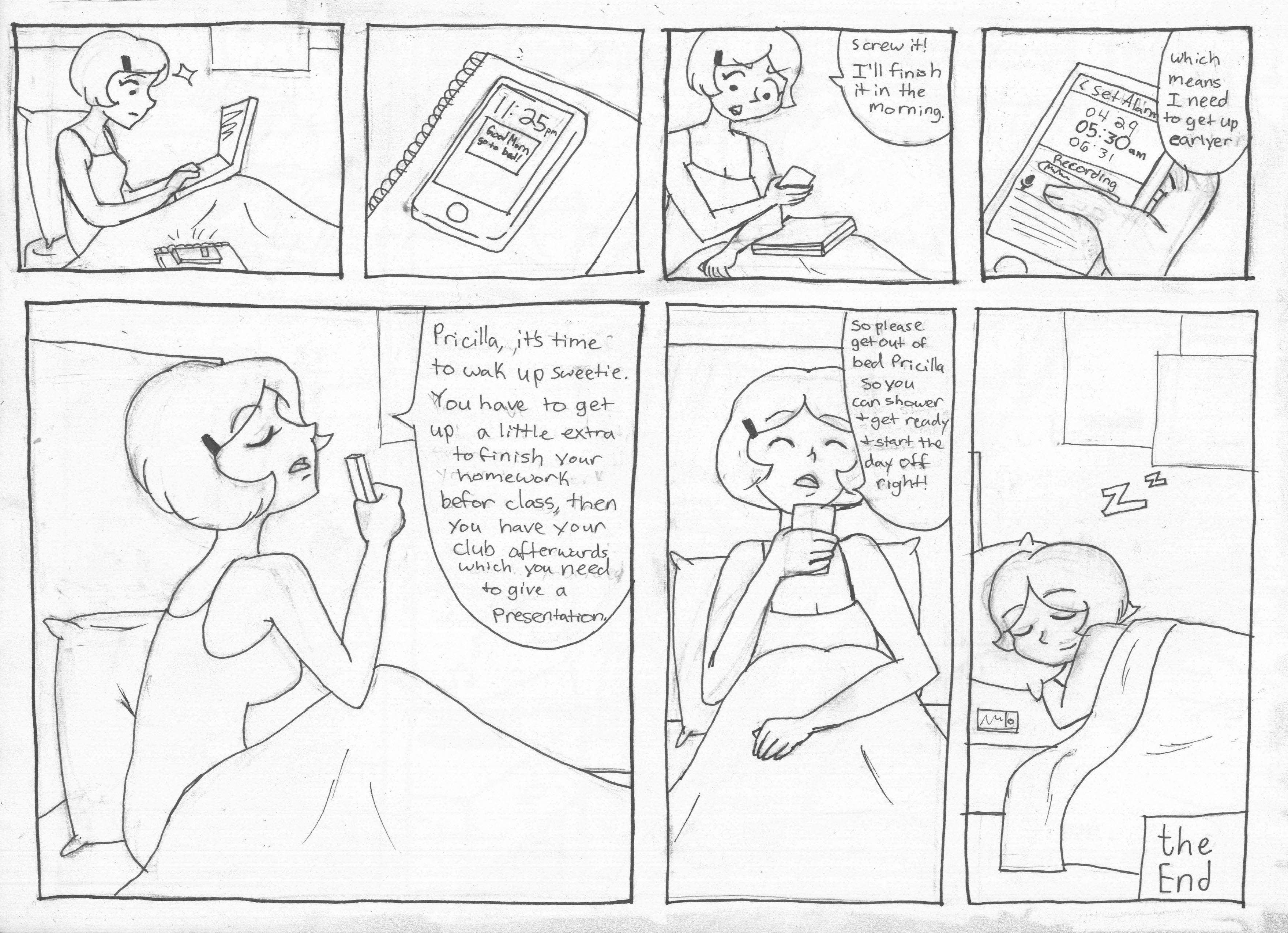
NIGHT VERSION
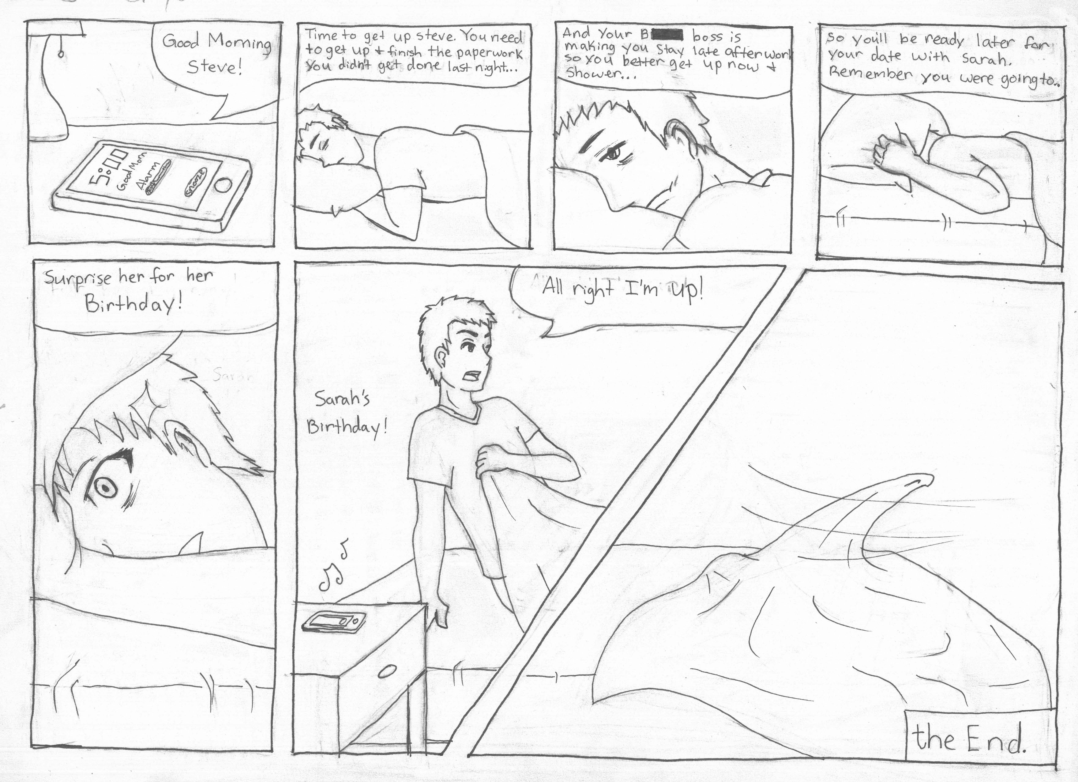
MORNING VERSION
TIME TO WAKE
Brand & UX/UI Design
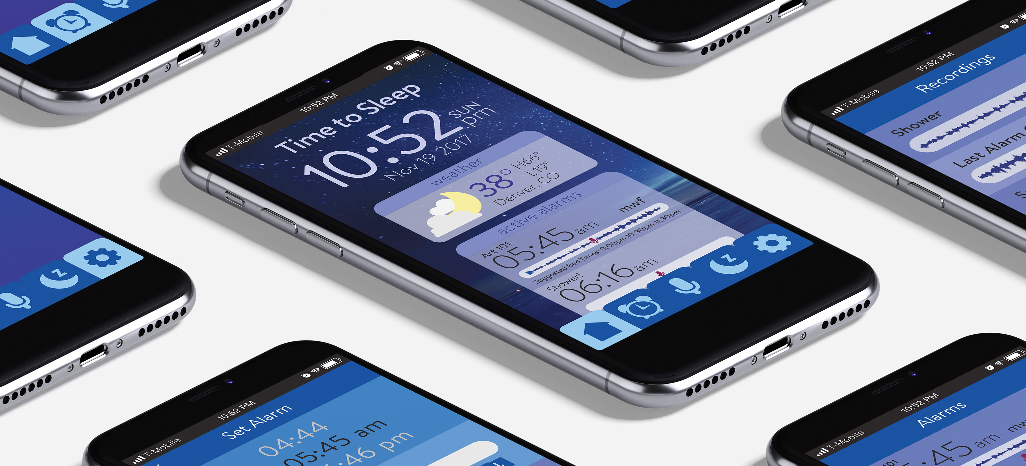
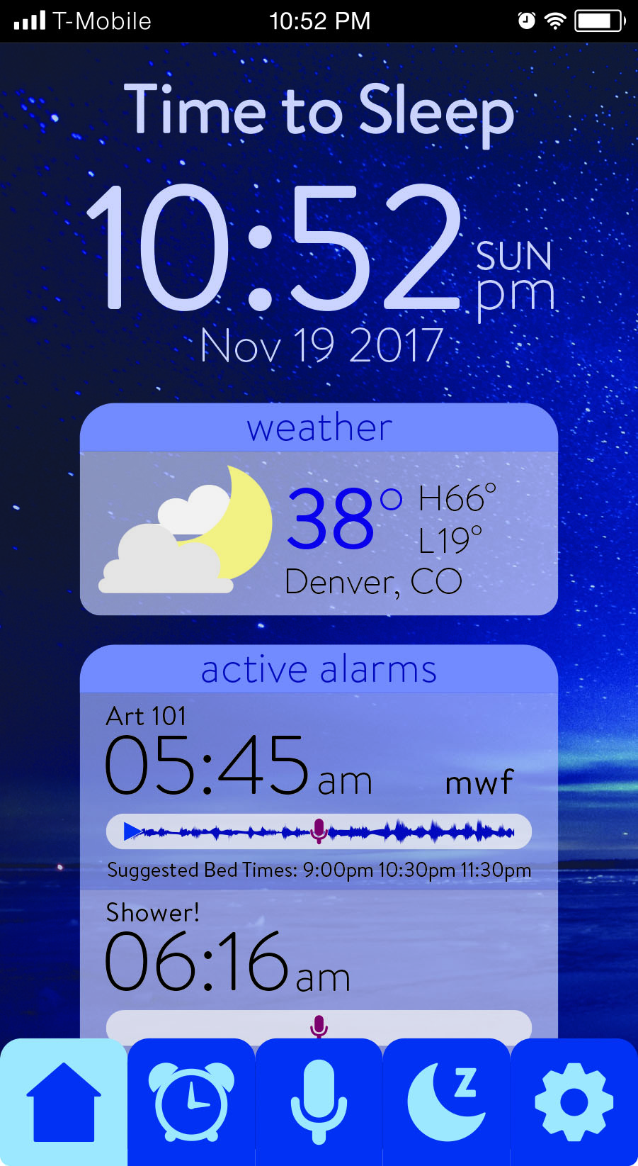
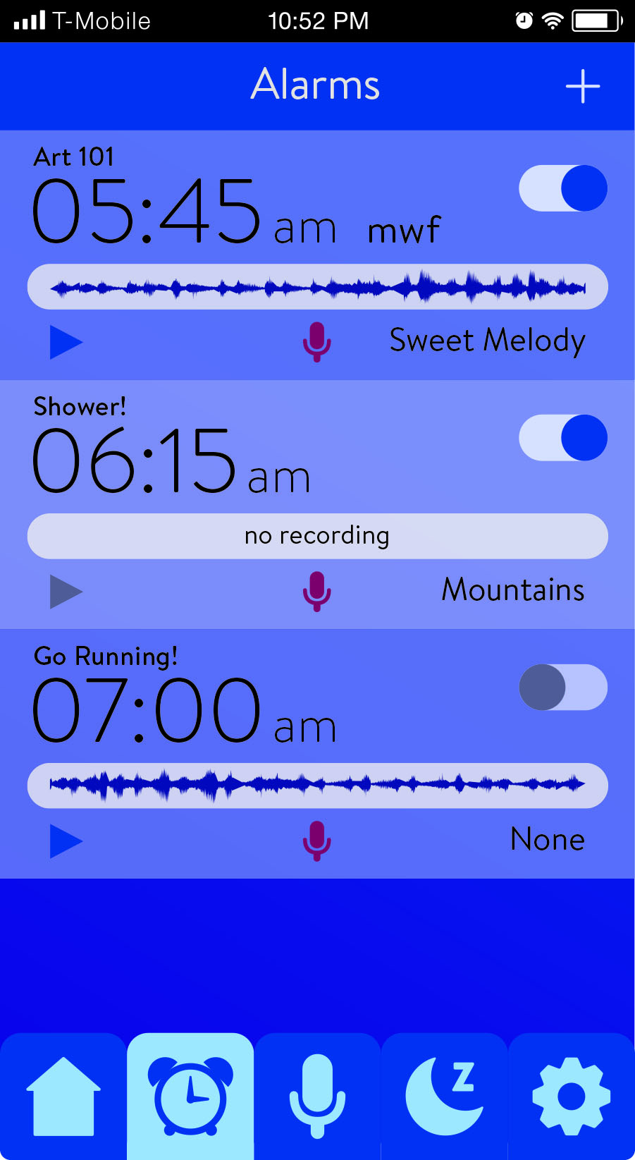
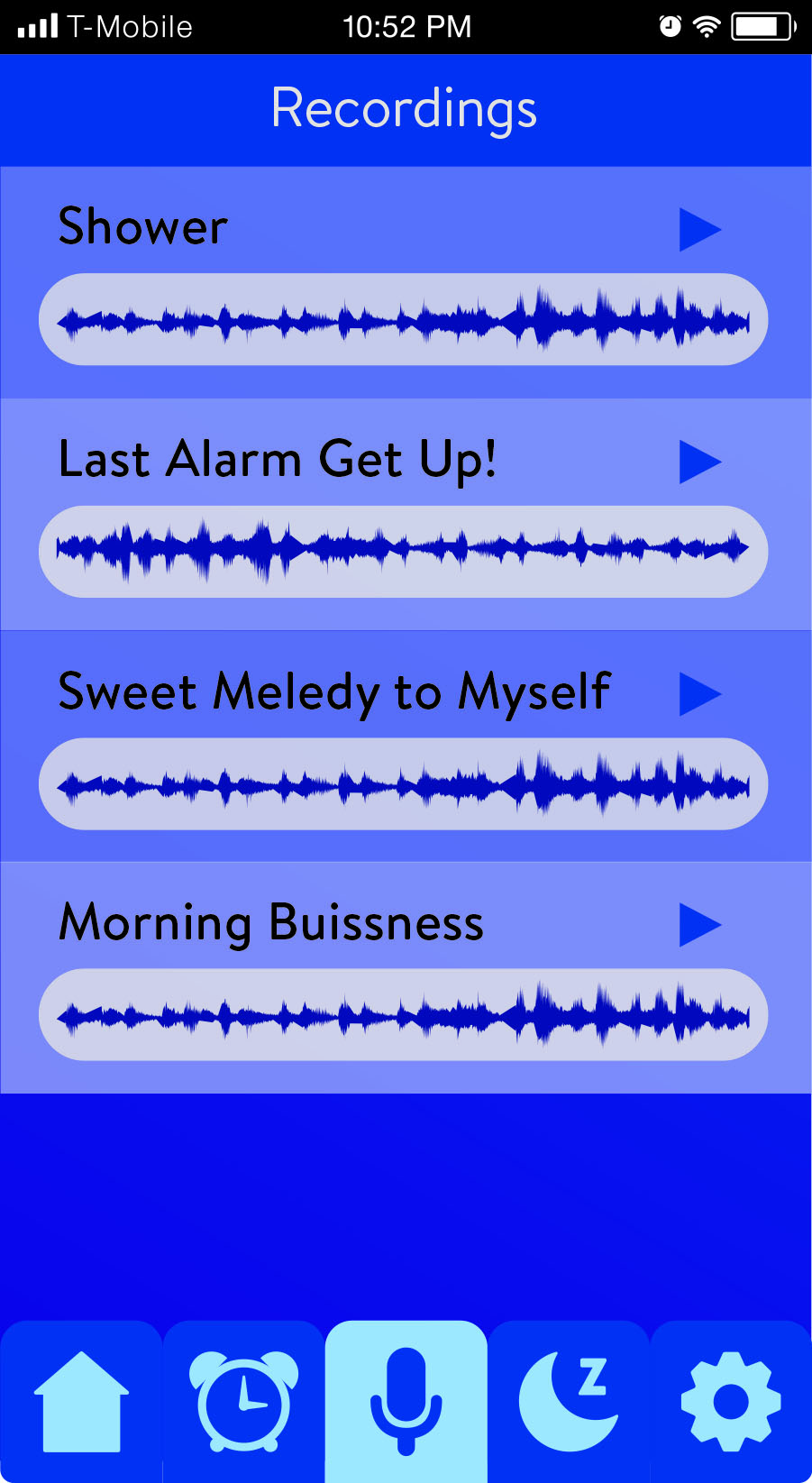
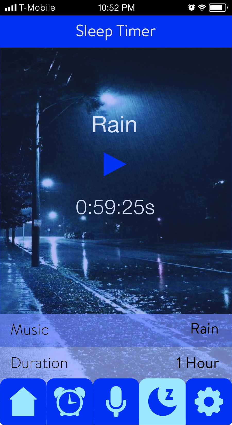
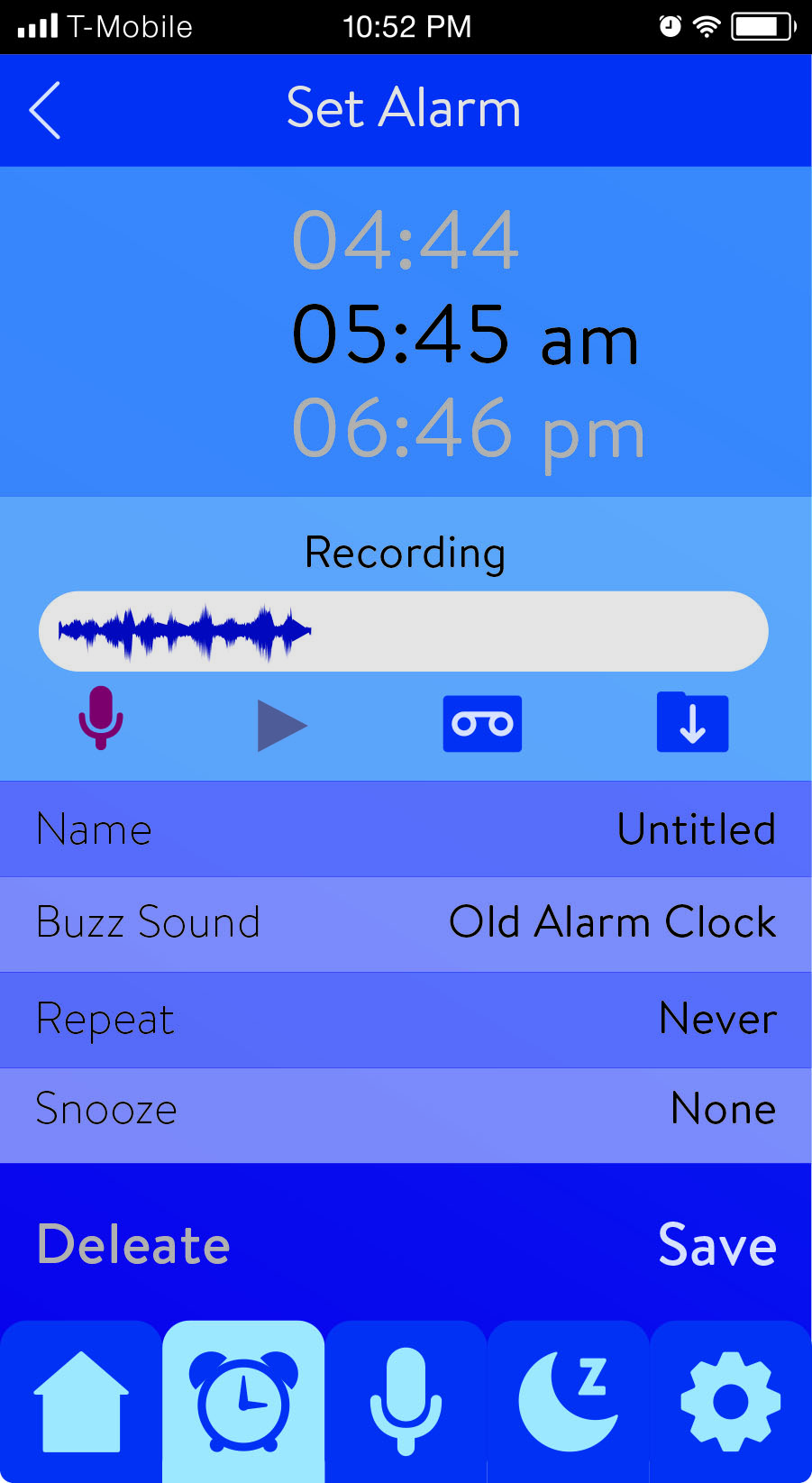
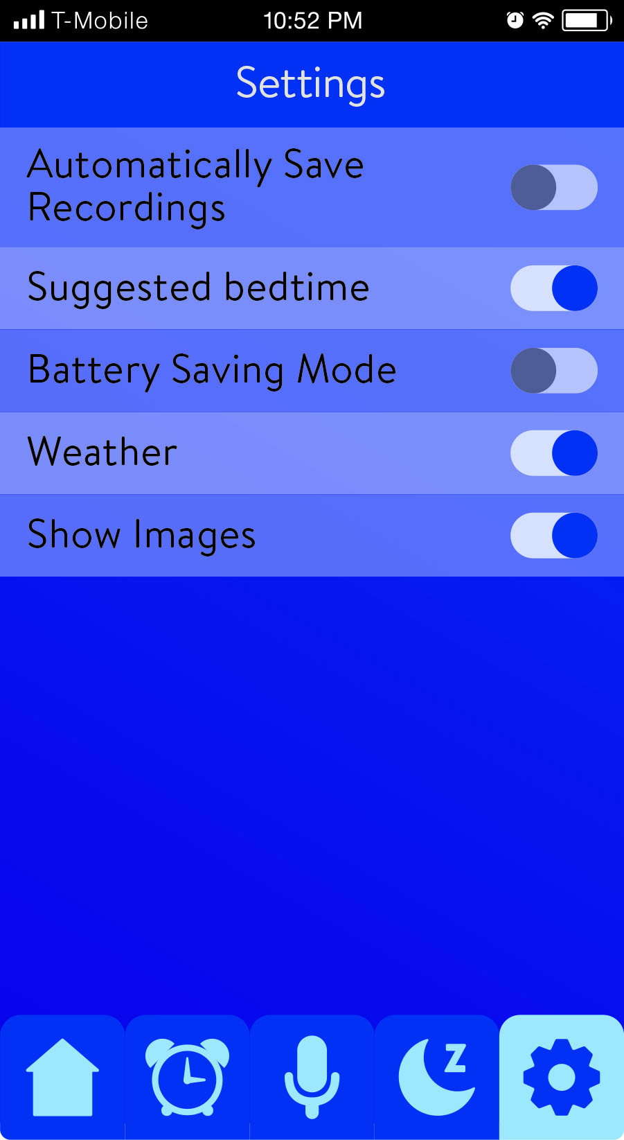
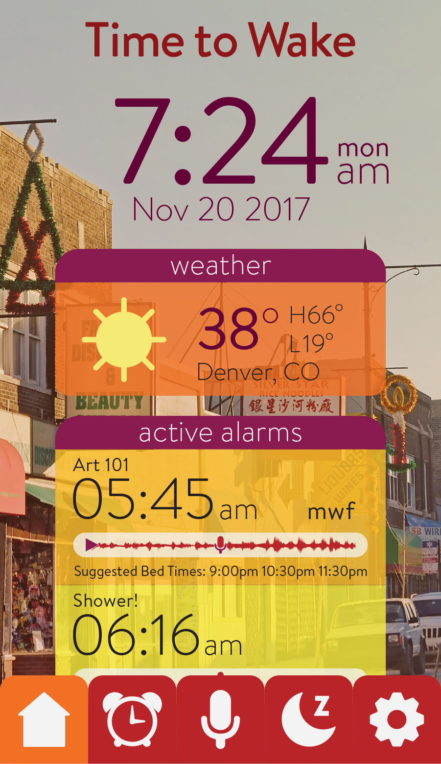
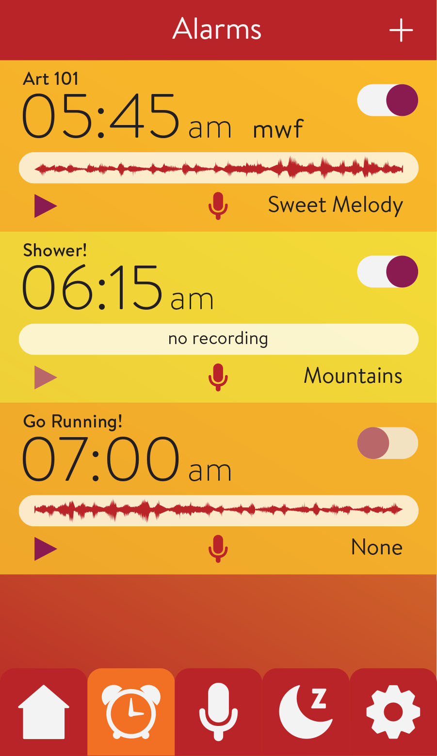
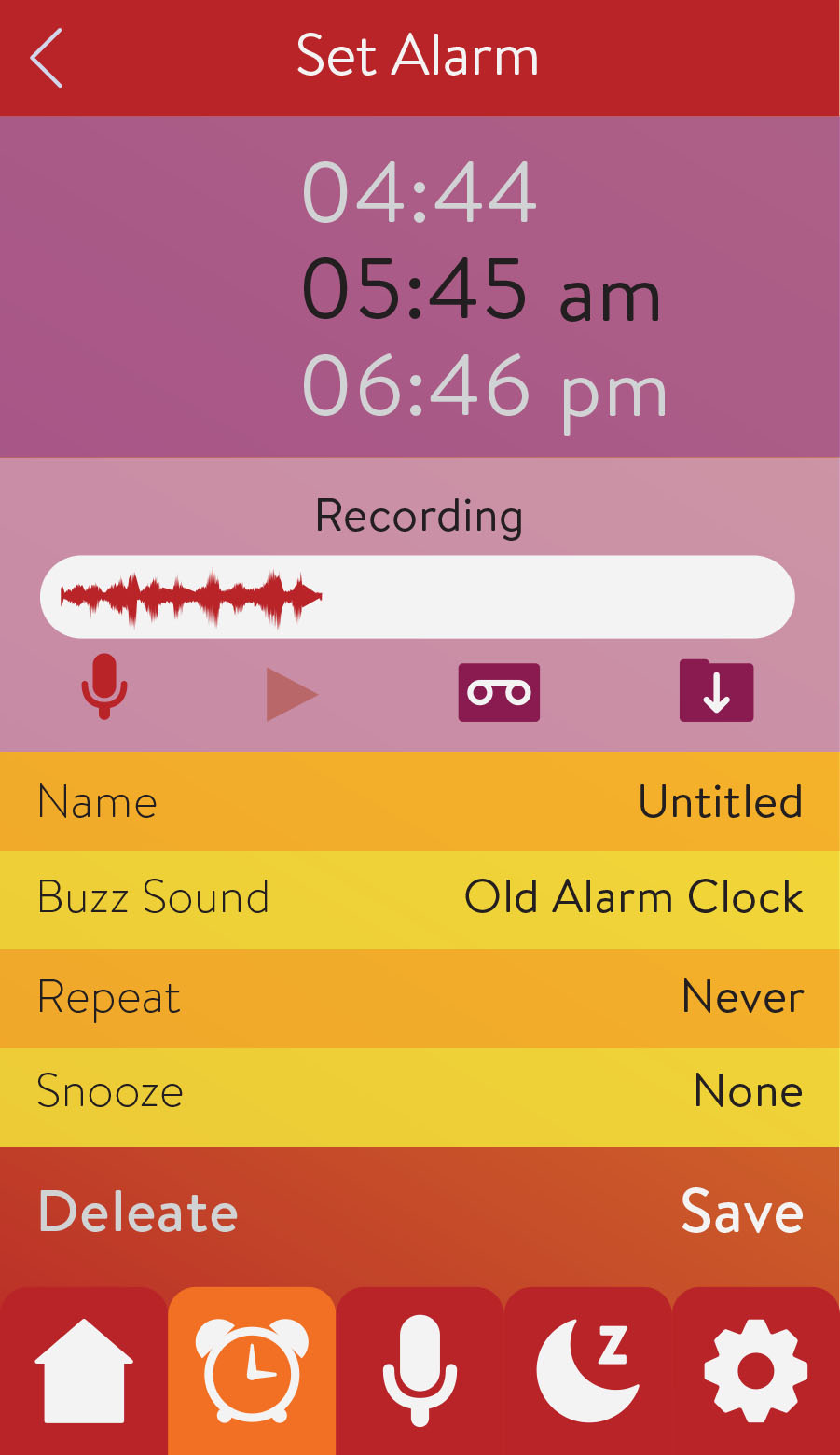
This alarm clock app allows users to personalize their alarm sound with voice notes. The alarm sound is a voice recording of the user stating either reminders or goals for themselves to wake up to; this allows them to state facts about the new day and encourage their groggy selves to get out of bed. The recording can easily be changed to allow daily use. So, each morning is a new alarm personalized specifically to that day. Sleep science states that it’s bad for you to stare at your phone before bed because the light will actually wake you up. Using this information, I designed two colored versions of the app. At night, the app displays the “Time to Sleep” version when the user is setting their alarm before bed. This night setting uses cool monotone hues in low contrast, keeping it easy on the eyes. However, the “Time to Wake” version is the opposite with warm, bright hues in higher contrast designed to help wake you up in the morning. With this app, you will never push the snooze button again… or at least not more than once!

