- Future of Behavioral Health
- Bunch Health Website
- Strong as Granite Ads
- Enfield Report
- Nexus-9 Network
- MedForums Social Media
- BrightLux Packaging
- CareerWise Colorado Branding
- Time to Wake
- Tatsu Izakaya Menu
- NCIA Advertising
- VitalGrace Packaging
- AWN Covers
- Jackson Pollock Website
- Renewable Energy Posters
- AIGA RMCAD
- Global Warming Infographic
- Cost of Water Ad
AIGA RMCAD
Brand & Print Design
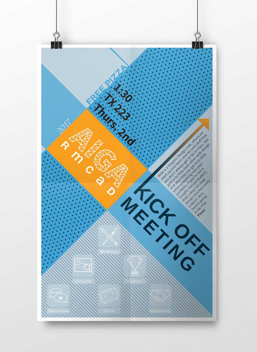
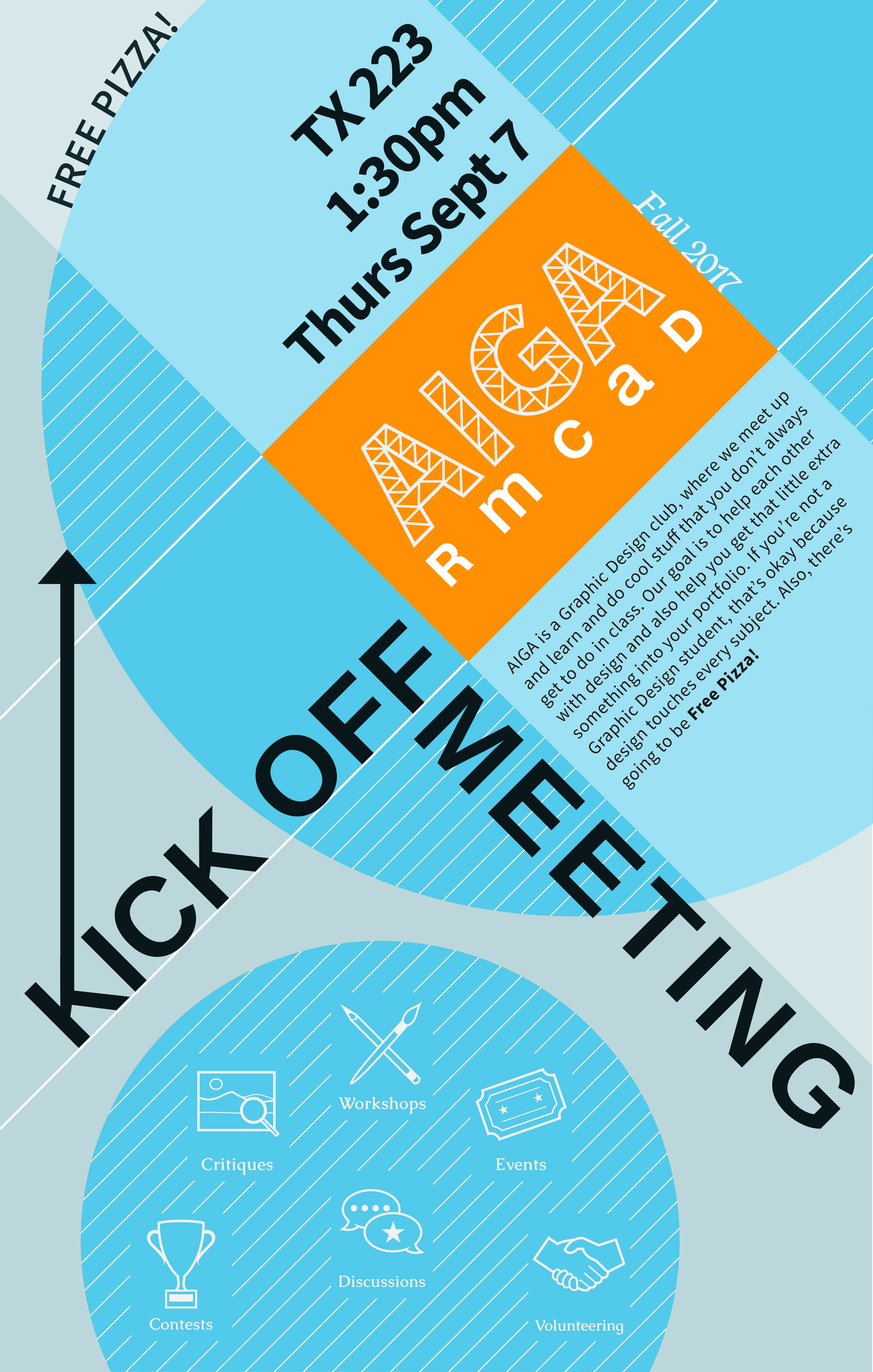
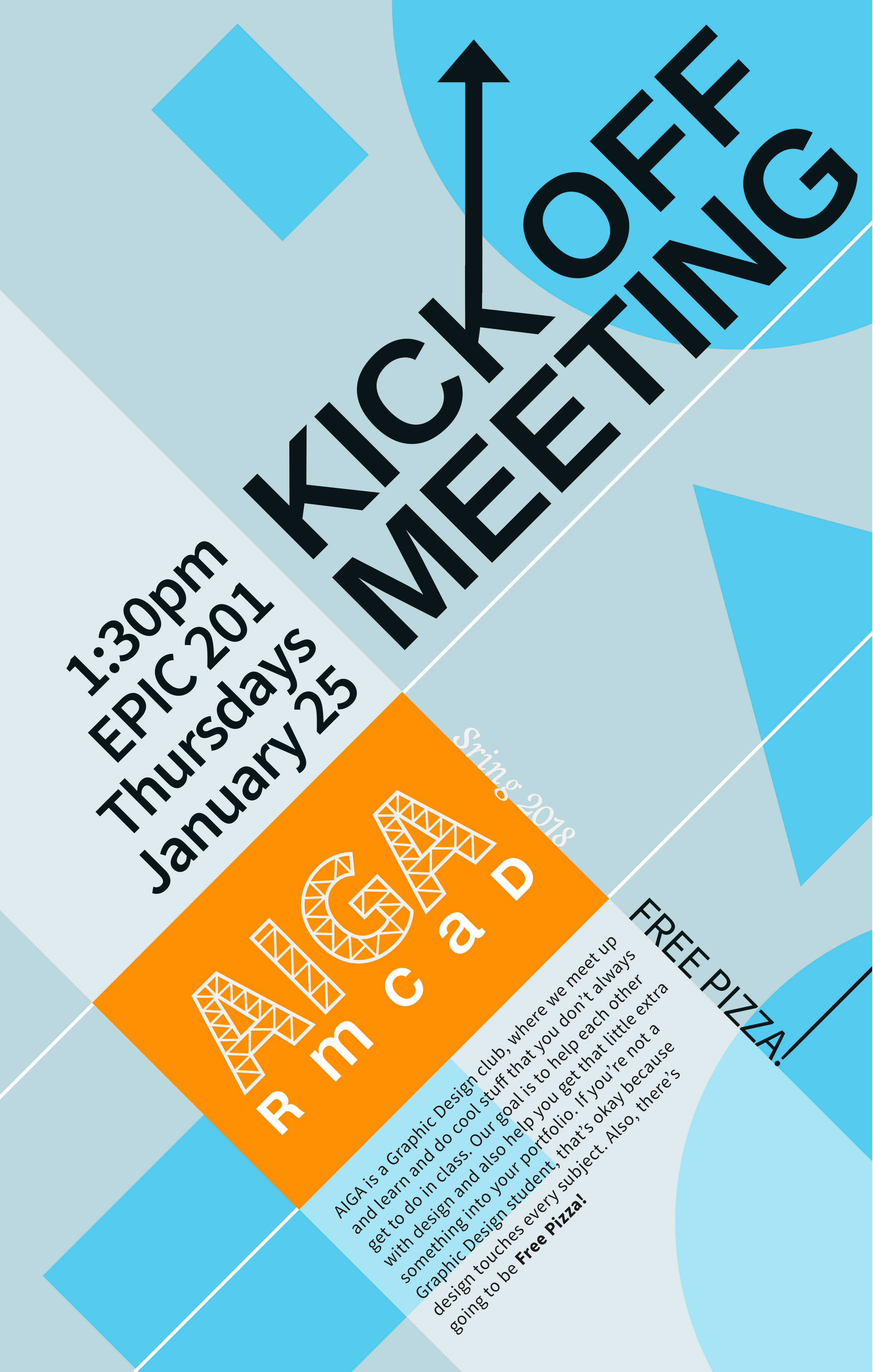
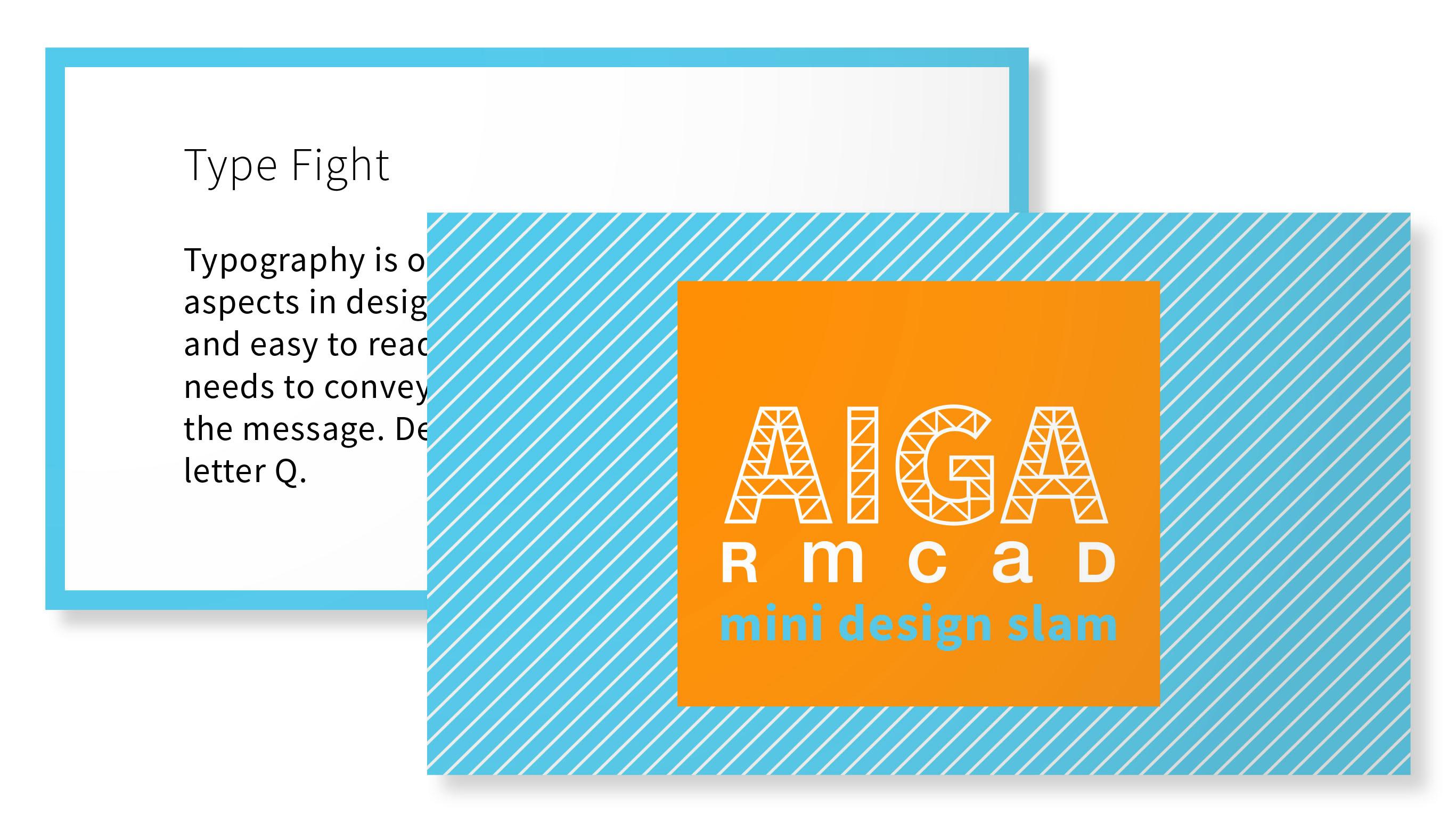
In the past two years, I was the president of our AIGA RMCAD Student Group at my school, Rocky Mountain College of Art + Design. During my run, we did a complete redesign of our look. The new logo captures the essence of the school and AIGA National with the line work representing RMCAD’s logo— The Dome—which was based on the sculpture. The blue and orange compliment each other and also pay homage to the groups that support it, AIGA & RMCAD. During my time as president, we hosted three Kick-Off Meetings to start off the semester, which I designed the materials for. This included three separate posters; the design was inspired by the Bauhaus movement with the use of diagonals, shapes and typography. Each poster embraces a different aspect of the movement; the first is patterns and type, second focused on mixing type with shapes and the third embraced playing with simple shapes. The posters were not designed at the same time, but rather one at a time over the course of the year.

