- Future of Behavioral Health
- Bunch Health Website
- Strong as Granite Ads
- Enfield Report
- Nexus-9 Network
- MedForums Social Media
- BrightLux Packaging
- CareerWise Colorado Branding
- Time to Wake
- Tatsu Izakaya Menu
- NCIA Advertising
- VitalGrace Packaging
- AWN Covers
- Jackson Pollock Website
- Renewable Energy Posters
- AIGA RMCAD
- Global Warming Infographic
- Cost of Water Ad
Dark *Chosen Version*


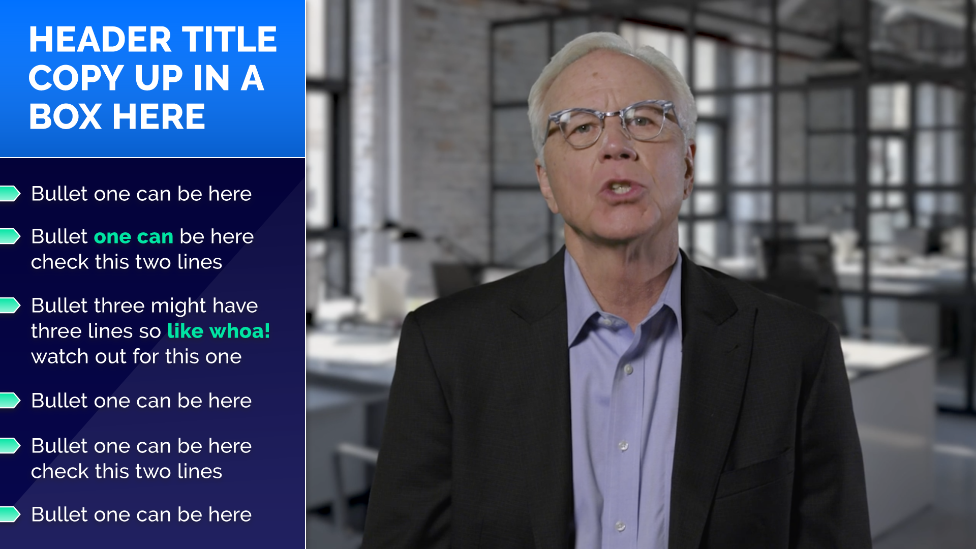
Light

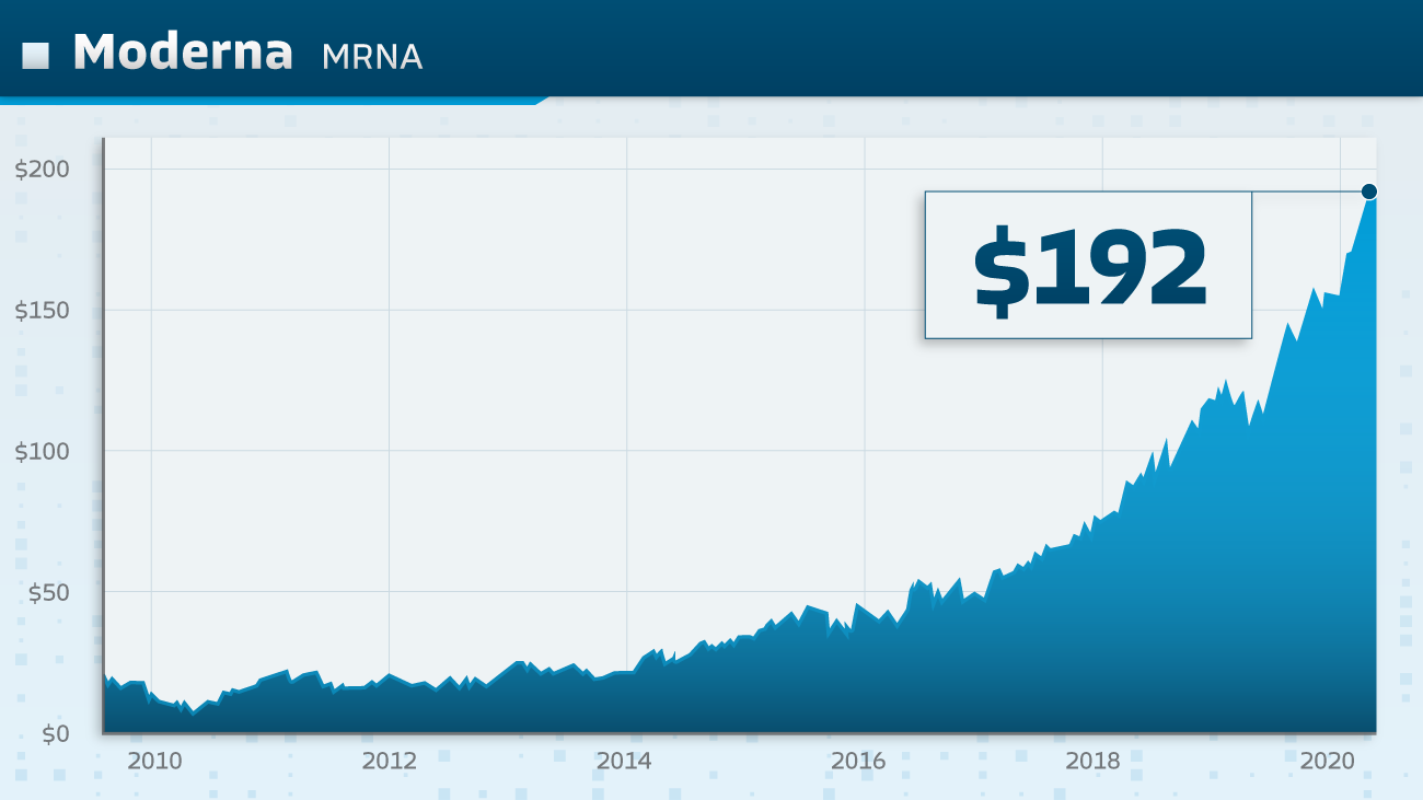
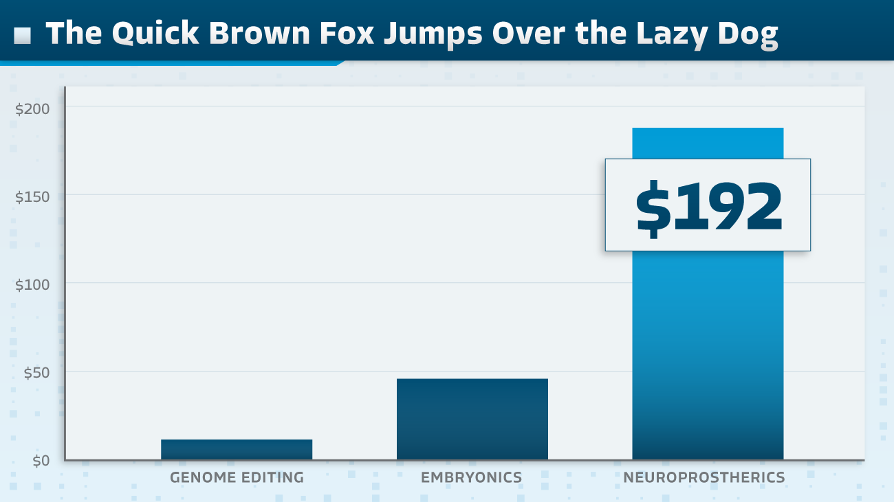
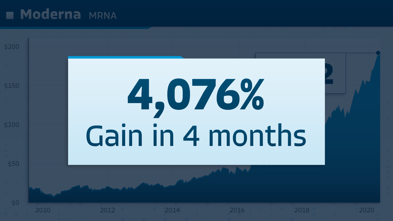


Colorful/Wild Card



NEXUS-9 NETWORK
Style Guides
Money Map Press is a publishing company based out of Baltimore that sells companies and stock market advice. In order to sell these promising stocks, they would create promotional videos that would showcase the data and research from these companies.
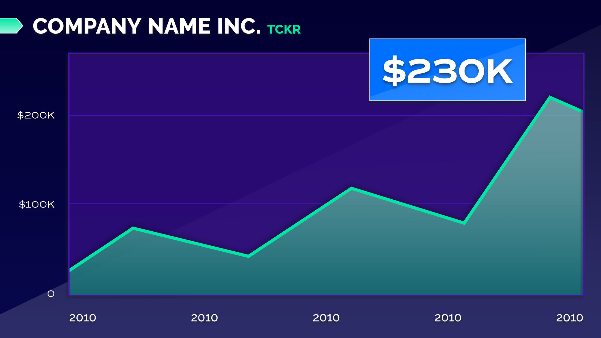
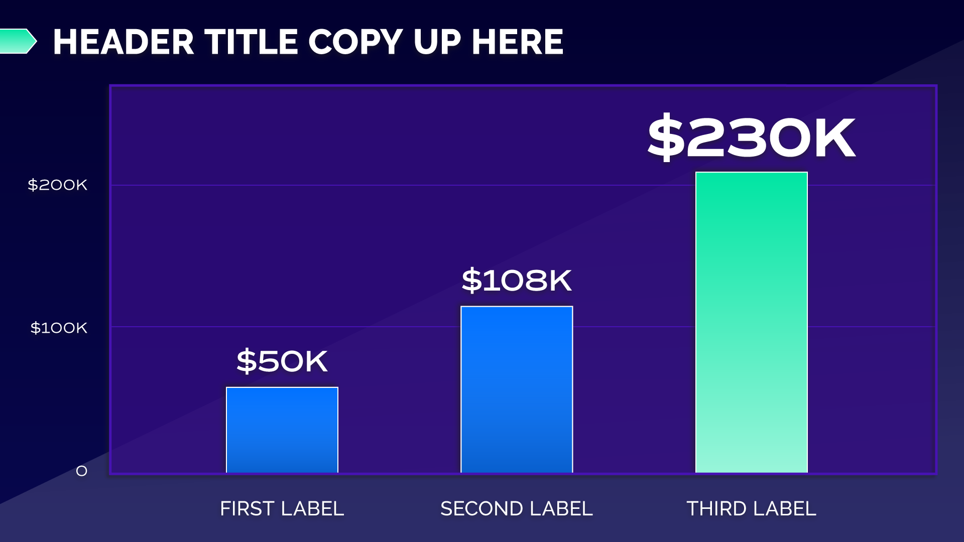
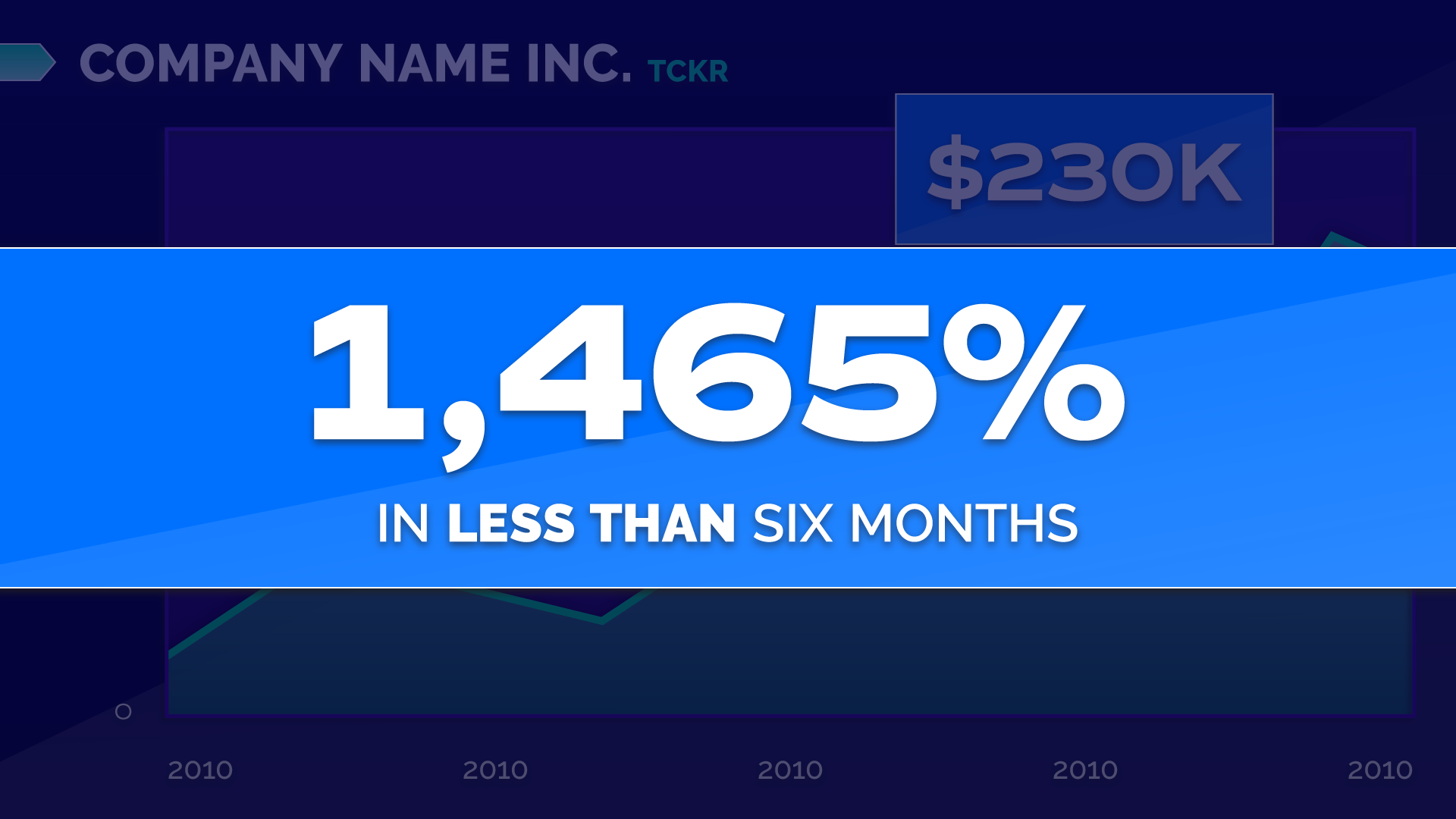
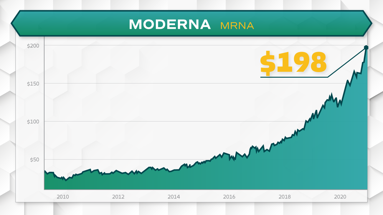
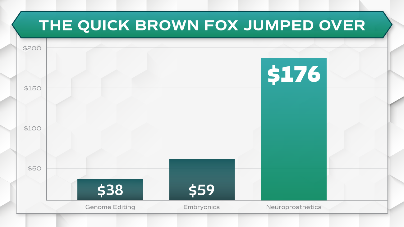
One of my projects at MMP was to create three potential design styles for the higher ups to use for their next promotional video. In this next promo, the Nexus-9 Network was selling two pharmaceutical companies centered around the development of new drugs and vaccines. Each style I defined with a set of colors, shapes, and typefaces, while also keeping the look very clean and medical.
The end result was a representation where one was light, another dark, and colorful/wildcard. Each choice featured graphs, lower thirds, over the shoulder, and a two up. These styles were presented along with three additional styles from senior graphic designer, Emily Karsh. My dark style was chosen, stating, “Style two feels so different from other previous promo videos, I feel like we should go with number two.”
