- Future of Behavioral Health
- Bunch Health Website
- Strong as Granite Ads
- Enfield Report
- Nexus-9 Network
- MedForums Social Media
- BrightLux Packaging
- CareerWise Colorado Branding
- Time to Wake
- Tatsu Izakaya Menu
- NCIA Advertising
- VitalGrace Packaging
- AWN Covers
- Jackson Pollock Website
- Renewable Energy Posters
- AIGA RMCAD
- Global Warming Infographic
- Cost of Water Ad


SARAH SWANSON
Brand & Packaging Design
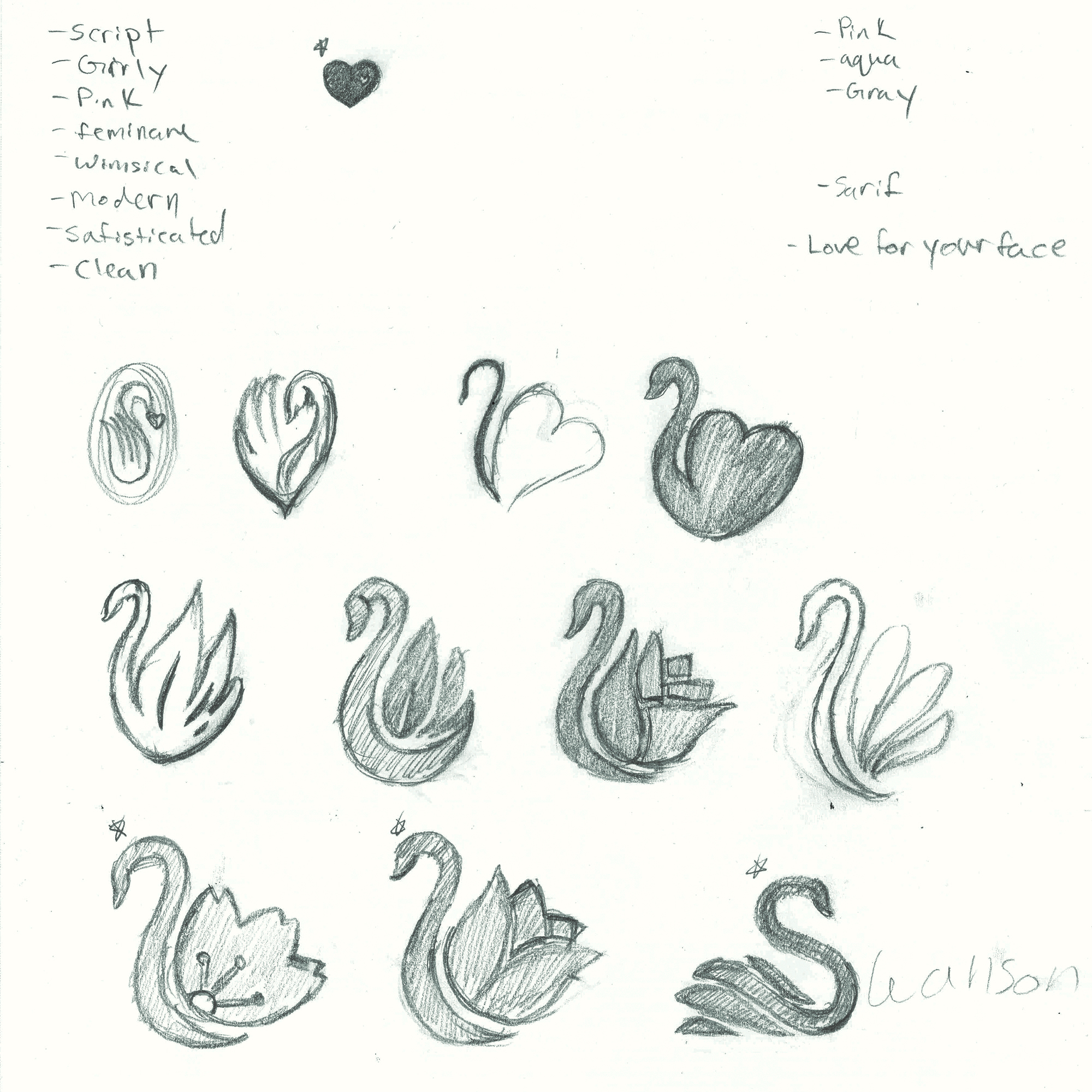
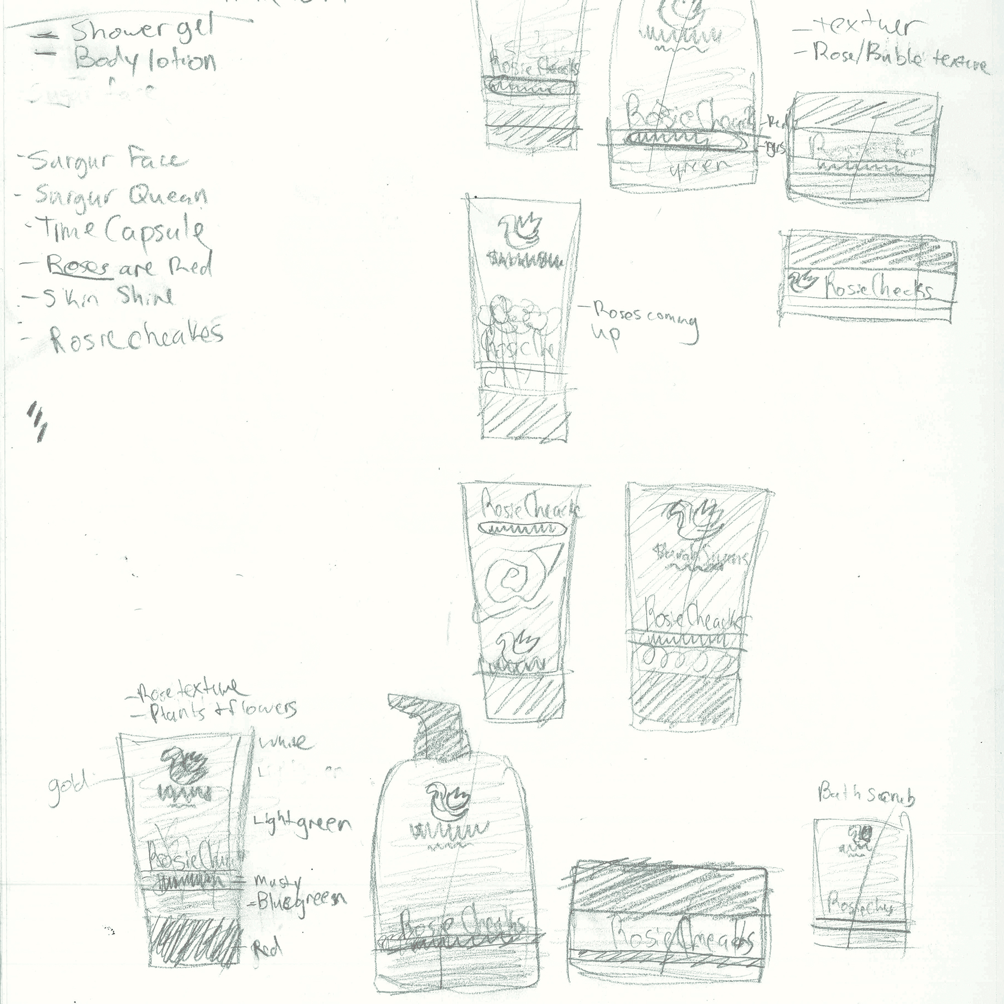
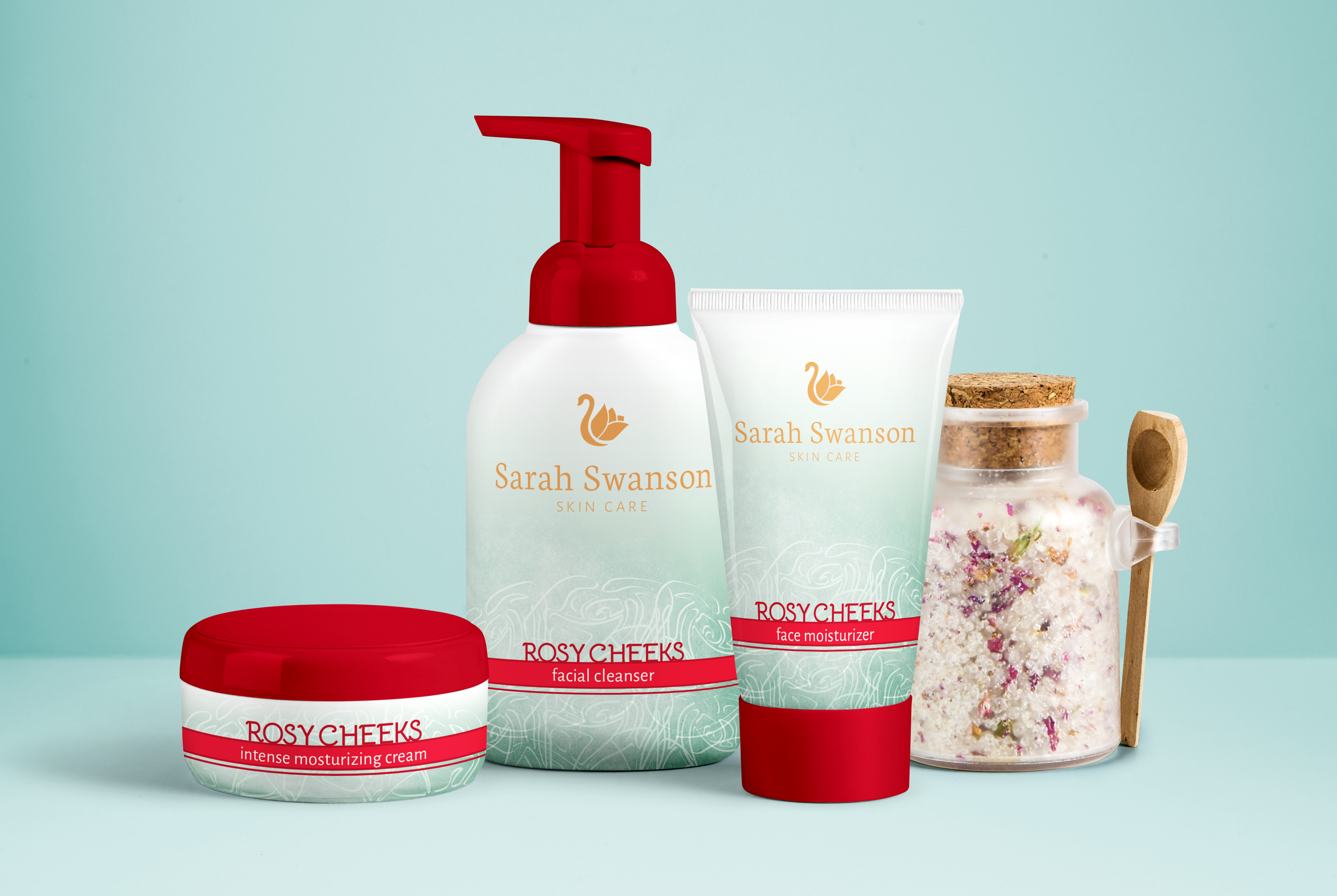
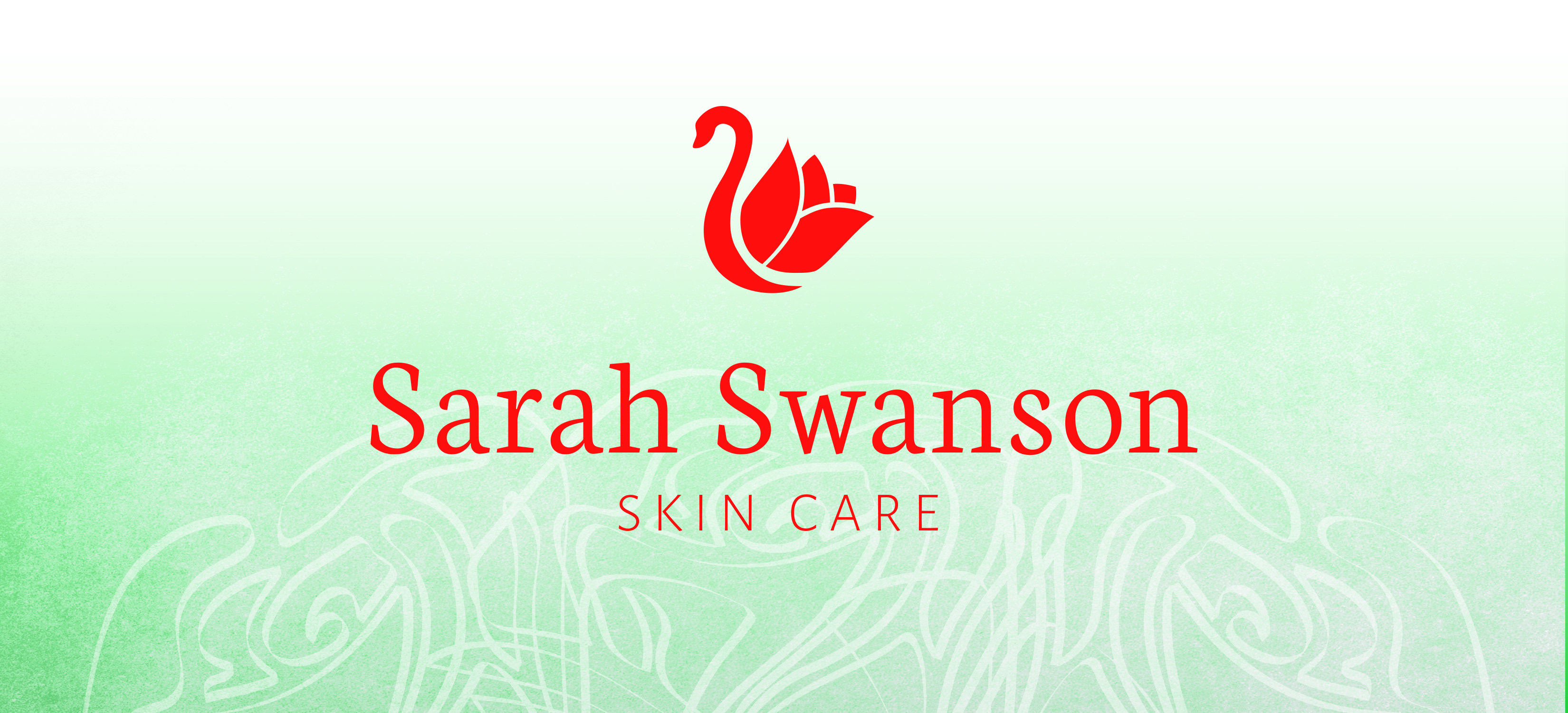
This skin care product was more about beauty, but also about the all-natural ingredients in their youth preserving formulas which communicated through the brand. With the combination of the image of the swan and rose, represents the herbs and nutrition that goes into each product. One of their product lines, Rosy Cheeks, focuses on moisturizing the skin to fight off wrinkles and keep your cheeks rosy. These concepts are communicated further in the packaging design with the use of color and texture. The complimentary colors allow the red in the name to really pop out from the pastel green and the soft texture. To break up the composition and push the significance of roses, I added the rosy artwork at the bottom.


